2012 Project Week:GeneralGUI
From NAMIC Wiki
Home < 2012 Project Week:GeneralGUI
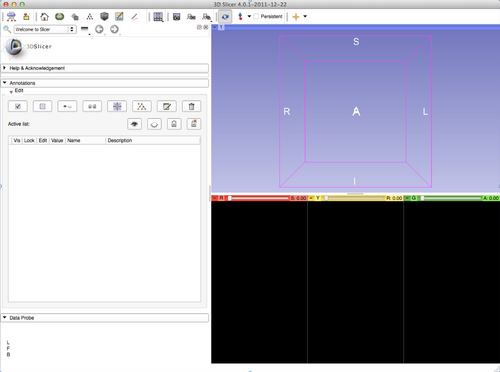
Current GUI
- Current GUI (as of Slicer 4.0.1)
Possible Changes
- Move the Module selector from the toolbar to the "Module panel"
- Motivations
- Saves horizontal space in the toolbar
- Visually links the module selector with the module panel
- Possibility to save some screen real estate
- By reusing the empty module panel dock title
- By moving the Slicer logo
- Allows multiple module panels open at the same time (1 module selector per module panel).
- Suggestion 1
- Motivations
- Simplify Picking toolbar
Suggestion
- Suggestion 1 as applied to the Annotation Module
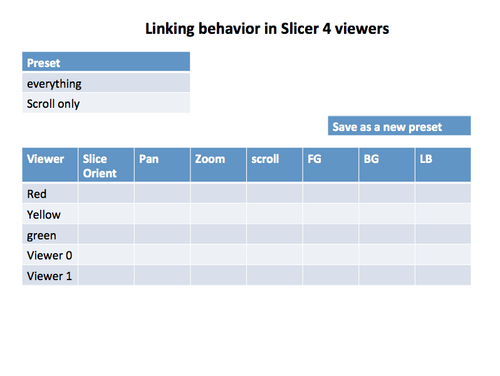
Controlling Linking
- insert into the viewer controller module.
- The module has a pull down with available presets. One of the pull down selection items is create a new preset.
- popup window with a clickable table like in the mock up.
See also Jim's analysis on the slicer wiki

